
Ness
Upgrading a charge card to a revolving card experience
Ness is a health and wellness rewards charge card where cardholders earn points for purchases at healthy merchants. Users redeem their points for rewards in our wellness marketplace. The card comes with wellness related benefits and all the benefits that come with a Mastercard.
In order to produce more revenue, Ness is creating a no annual fee revolving credit card, where users can make a minimum payment each statement period and be charged interested on their remaining balance.
Problem
I audited the entire app and defined where the experience needed to change for a revolving credit card. The biggest adjustment was in the bill pay experience.
a way to view and select the minimum payment they have to make each statement period, so they don’t become delinquent & get charged late fees.
a transparent bill pay and interest charge experience, so they can make an informed decision when they pay their bill each statement period.
Team
My Role: Product Design, Digital Illustration
Head of Experience: Kenneth So
Collaborating Designer: Bao Lam
Product Manager: Jessica Carta, Zachary Sweeney, Jeremey Duvall
Engineers: Kwan Cheng, Morgan Baron
Scope
Company: Ness
Timeline: 3 weeks
Platform: IOS app
Tools: Figma, Adobe Photoshop
The Research Process
Why update the bill pay experience?
Have now: A charge card with an annual fee of $349/yr
Will have: A revolving credit card with an annual fee of $0/yr
A charge card vs a revolving credit card
Differing from Ness’s charge card, where users pay the full statement balance each period, users can make a minimum payment (that can change depending on the balance they carry) each statement period and carry a balance that gets charged interest.
Users have the option to pay the full statement balance and not be charged interest.
Competitive audit
Insights
Chase and Capital One, the interest charge isn’t clearly explained in the app
Apple’s credit card experience, the user is nudged in different places of the bill pay experience, to pay more to avoid interest.
interest is shown clearly when a user checks their bill & when they make a payment
Themes
Transparency
Clarity
Use cases: Make a minimum payment
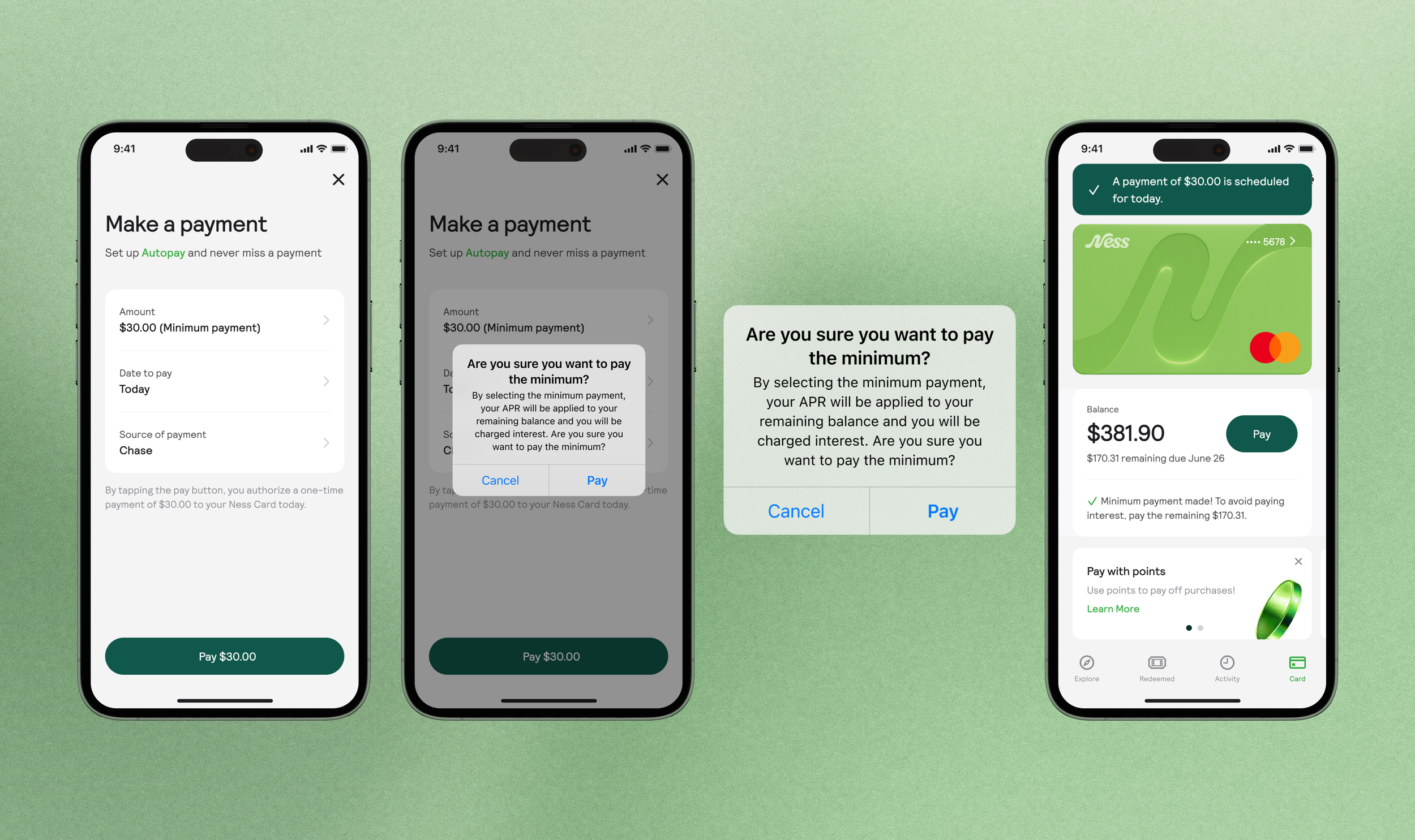
Make a minimum payment - one time payment
Select minimum payment
Select custom amount
Schedule a minimum payment
Make a minimum payment when one has already been made
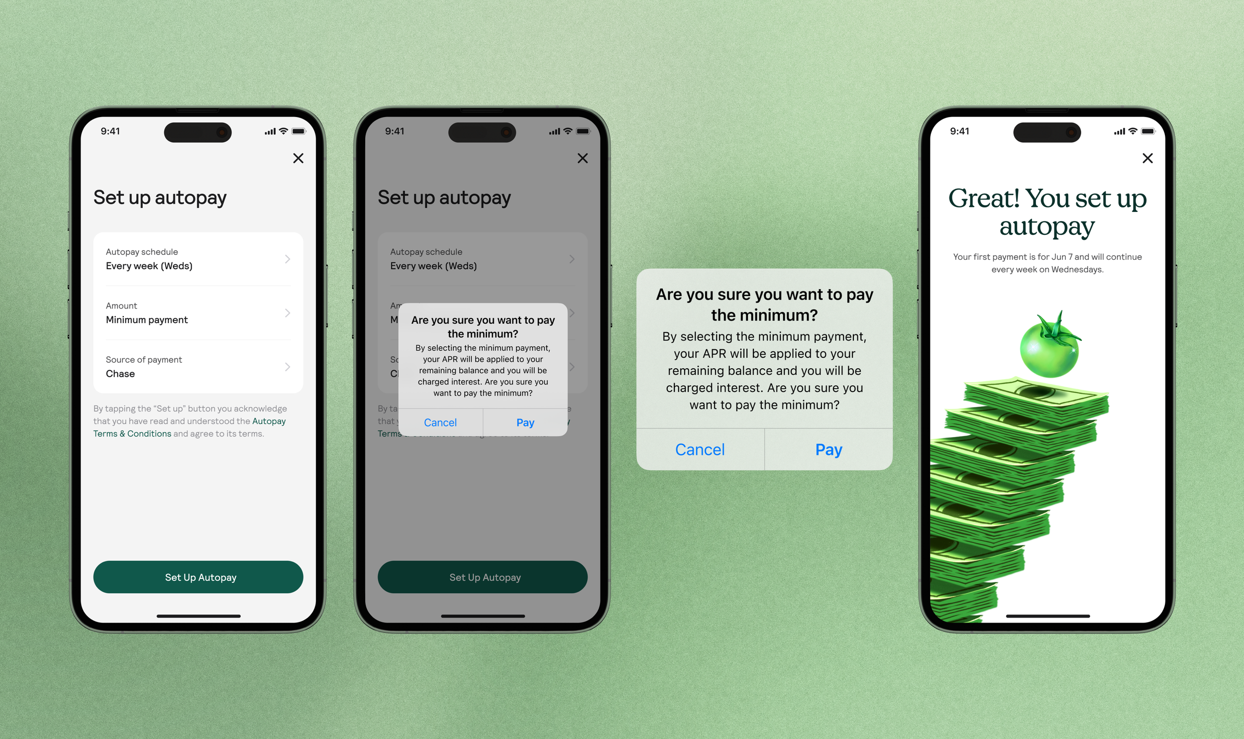
Make a minimum payment - autopay
Every week
Every 2 weeks
Every month
Use cases: View a minimum payment & interest charge
In order to capture every state of the bill pay experience accurately, I along with the Head of experience mapped out the different states of payment over three payment cycles and when a user is charged interest.
The Design Process
Problem
Revolving credit card holders need a way to pay the minimum each statement period.
Solution: Informing users of an interest charge
The system modal educates the user of the interest charge as they make a payment, and gives them a chance to confirm their decision.

Background
Users can make a minimum payment (that can change depending on the balance they carry) each statement period.
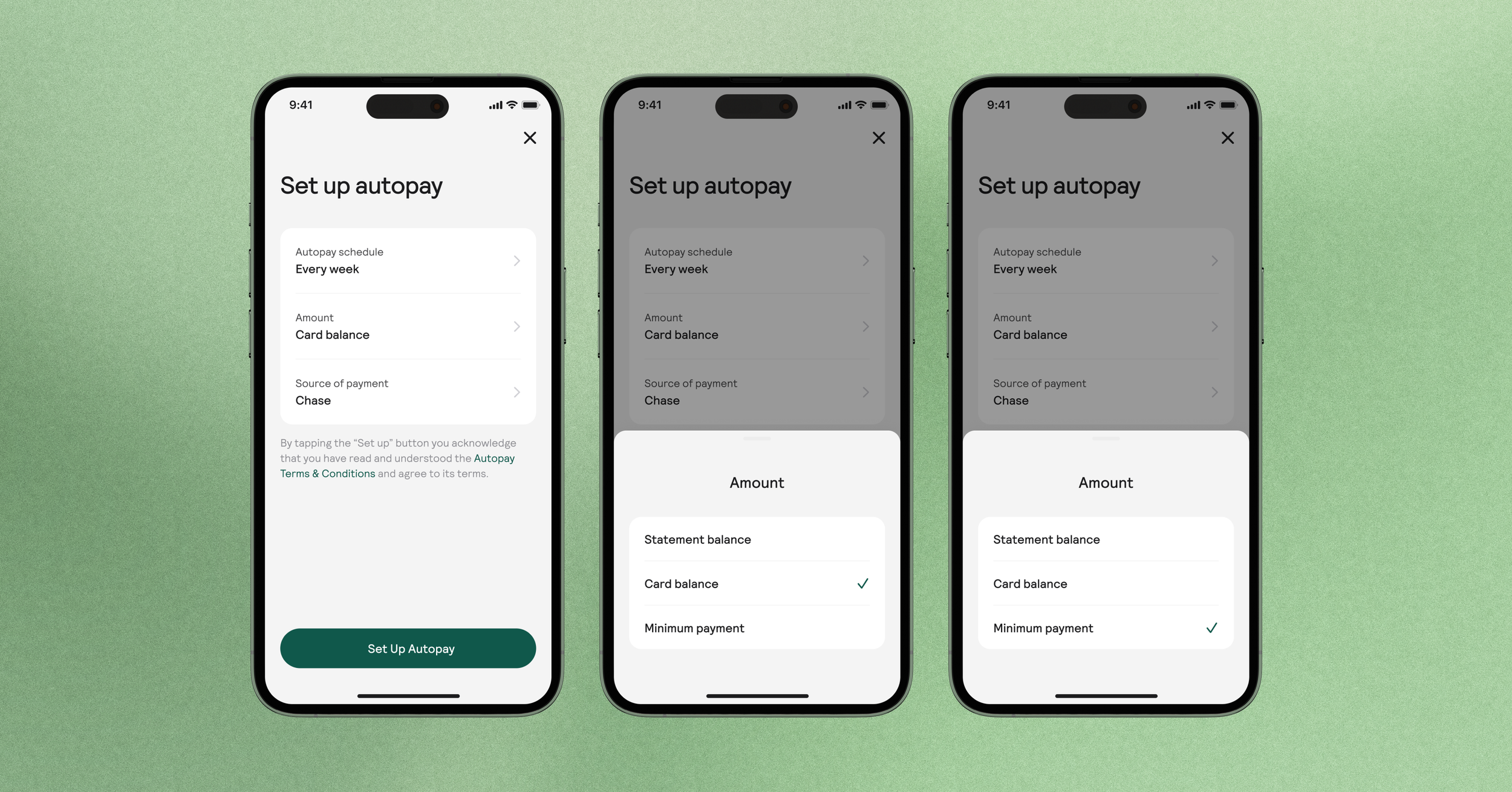
Solution: How to handle a variable value (Minimum payment)
For use cases where a user makes a minimum payment for a future date, they are still able to select a minimum payment, but the value isn’t shown because the balance they hold for that day cannot be assumed.
Autopay
Schedule a minimum payment
Viewing the interest charge in the activity tab
Interest charges are shown clearly in their activity and on their payment card.
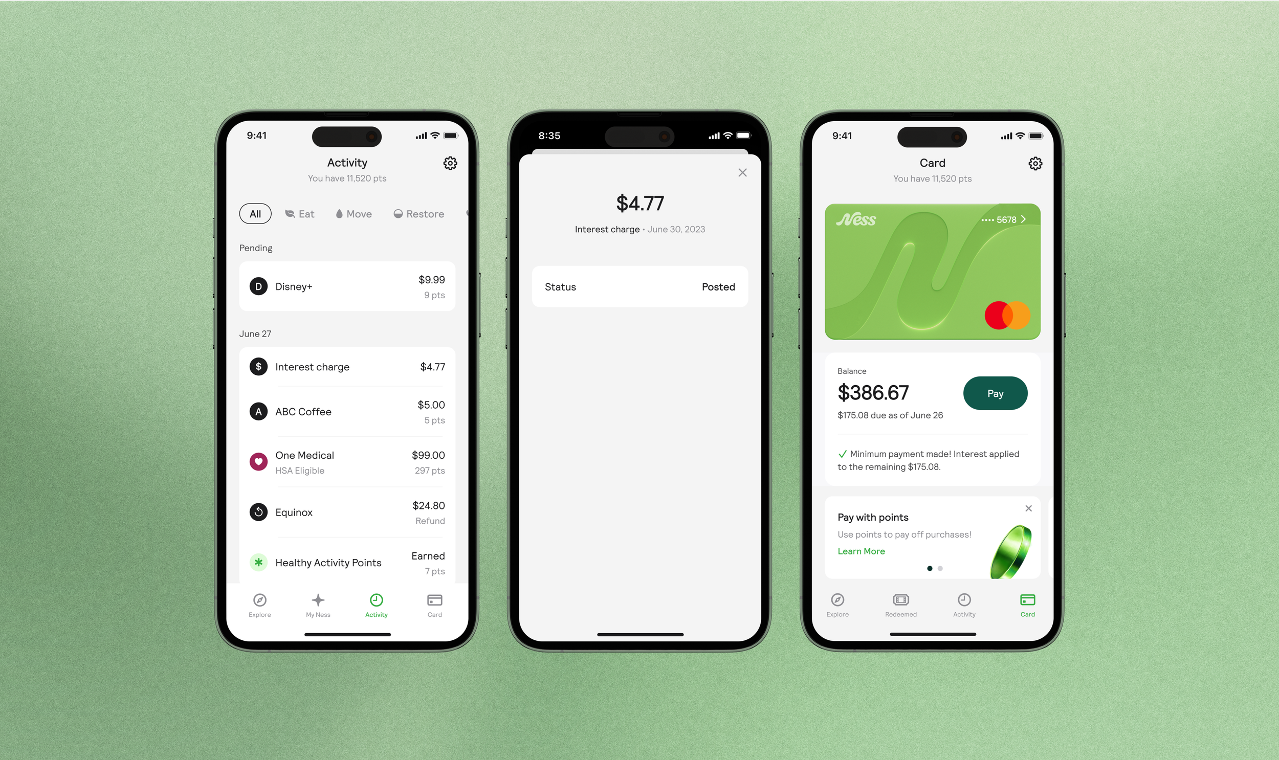
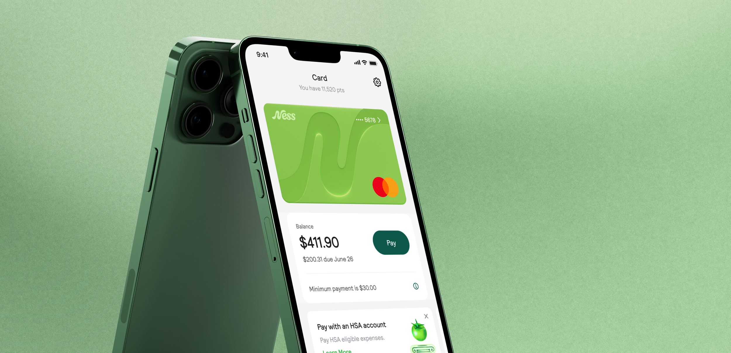
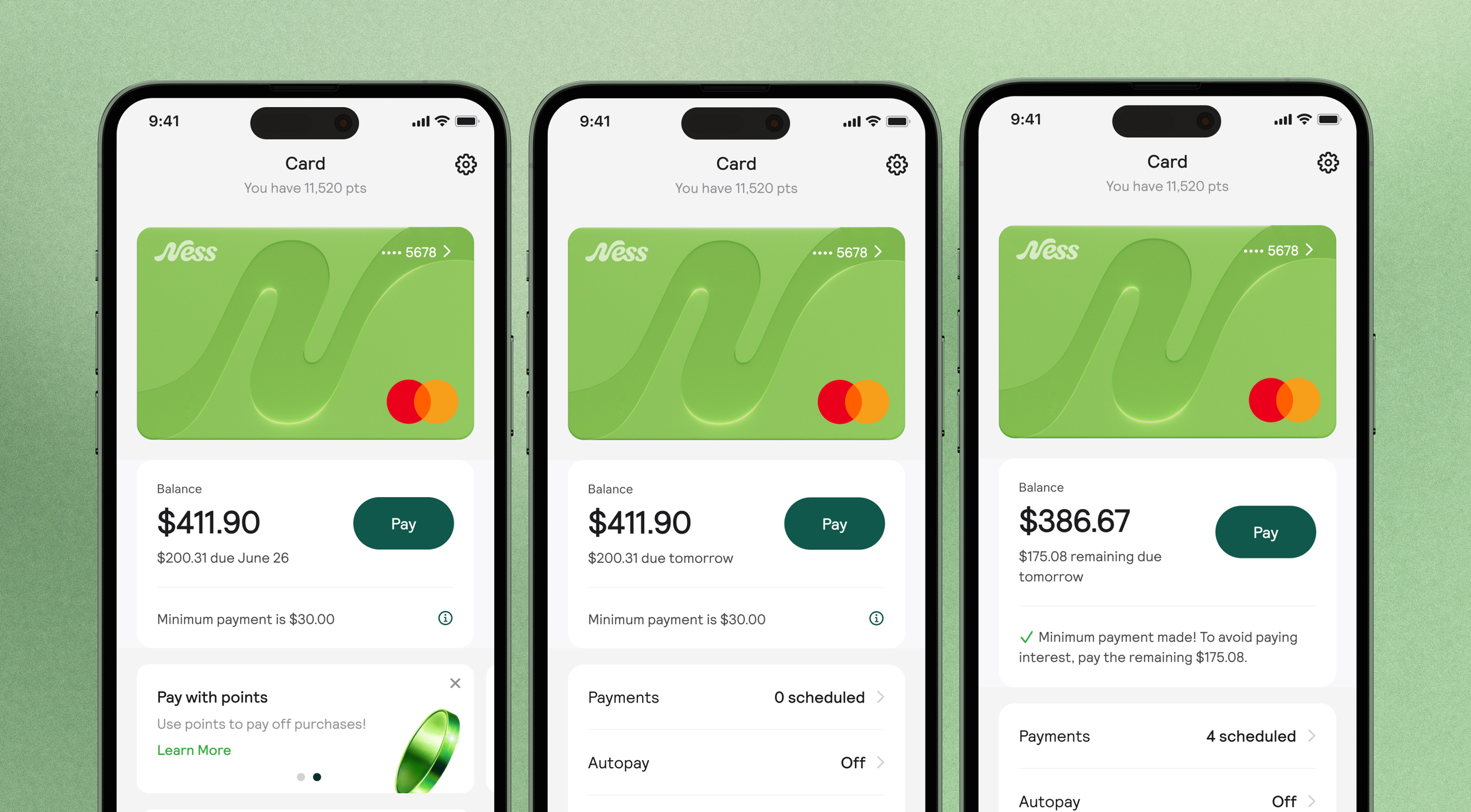
Solution: Clearly showing payment information all in one card
All in one card, users can view when their due date is approaching, the minimum they need to pay, and if they are being charged interest.
Solution: Educating users about minimum payment
We help users learn more about what a minimum payment is with a tool tip. With this user’s can make a more informed decision when it comes to their payments.
“Your minimum payment is the lowest amount you can pay every month while keeping your account in good standing. Making at least the minimum payment on your Ness credit card every billing cycle ensures that you do not get stuck with late fees. However, paying more than the minimum amount each month will help you avoid paying interest.”

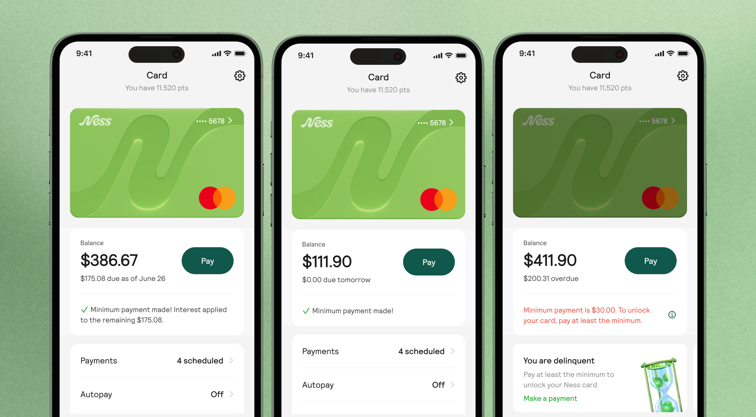
Use cases: View a minimum payment & interest charge
Payment due in more than 2 days (default state)
no payment made
no interest chargedPayment due in 2 days or less (approaching payment)
no payment made
no interest chargedPayment due tomorrow/today (interest not charged yet)
Minimum payment made
no interest chargedPayment due tomorrow/today (paid in full)
Full payment made (statement balance)
no interest charged3 days between statement period, Payment due (interest being charged)
Minimum payment made
interest charged (applied to remaining balance)Delinquent
No payment made
interest charged (applied to remaining balance)
Solution: Copy adjusted for each of the 6 states
For each state, the copy is adjusted to inform the user of...
the state of the minimum payment
if they will be charged interest/ if they are being charged interest
Making payments more enjoyable: Brand illustrations
Adding in brand illustrations for banners and success screens, makes routine task a little more enjoyable.

Other improvements to the Revolving card experience
Problem
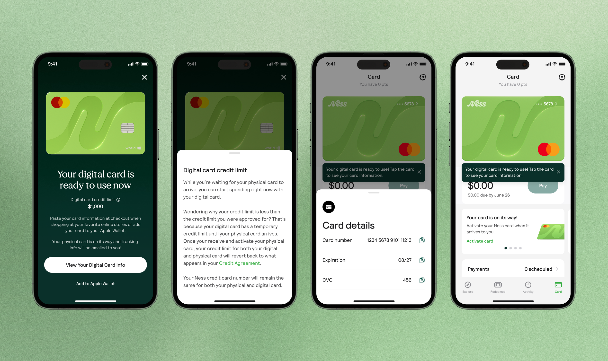
One of our business objectives is increasing user spend. Users don’t always know they have a digital card they can use when they first start using the app
Solution
In addition to upgrading the bill pay experience, we decided we needed to better introduce the digital card during onboarding. We wanted users to understand they have a digital card they can use right away (and a temporary associated credit limit), until their physical card arrives.
Reflections & Next steps
Auditing the design system
Auditing the app was also an opportunity to look at the components used & every use case. Moving very quickly meant not all the components used in designs were accounted for in the design system.
The design team worked together to revamp the design system and create new buttons, list components, check boxes, type use, and more. We added a range of green shades to the brand color palate to apply to backgrounds & components, giving the app a more branded feel.